Most software agencies rely on referrals, word-of-mouth, or outbound outreach to land clients.
But what about the prospects already visiting their website?
Every day, potential clients land on agency websites, consider reaching out, and then… leave. They hesitate. They second-guess. They get distracted.
One reason? The Contact page.
For many agencies, this page is an afterthought. But a poorly optimized contact form can quietly kill conversions—turning warm leads into lost opportunities.
I recently visited WestonDEV’s website, a software development agency in Weston, Florida, and spotted quick wins that could make their Contact page more effective.
No consultants. No ad spend. Just simple tweaks that make it easier for visitors to reach out.
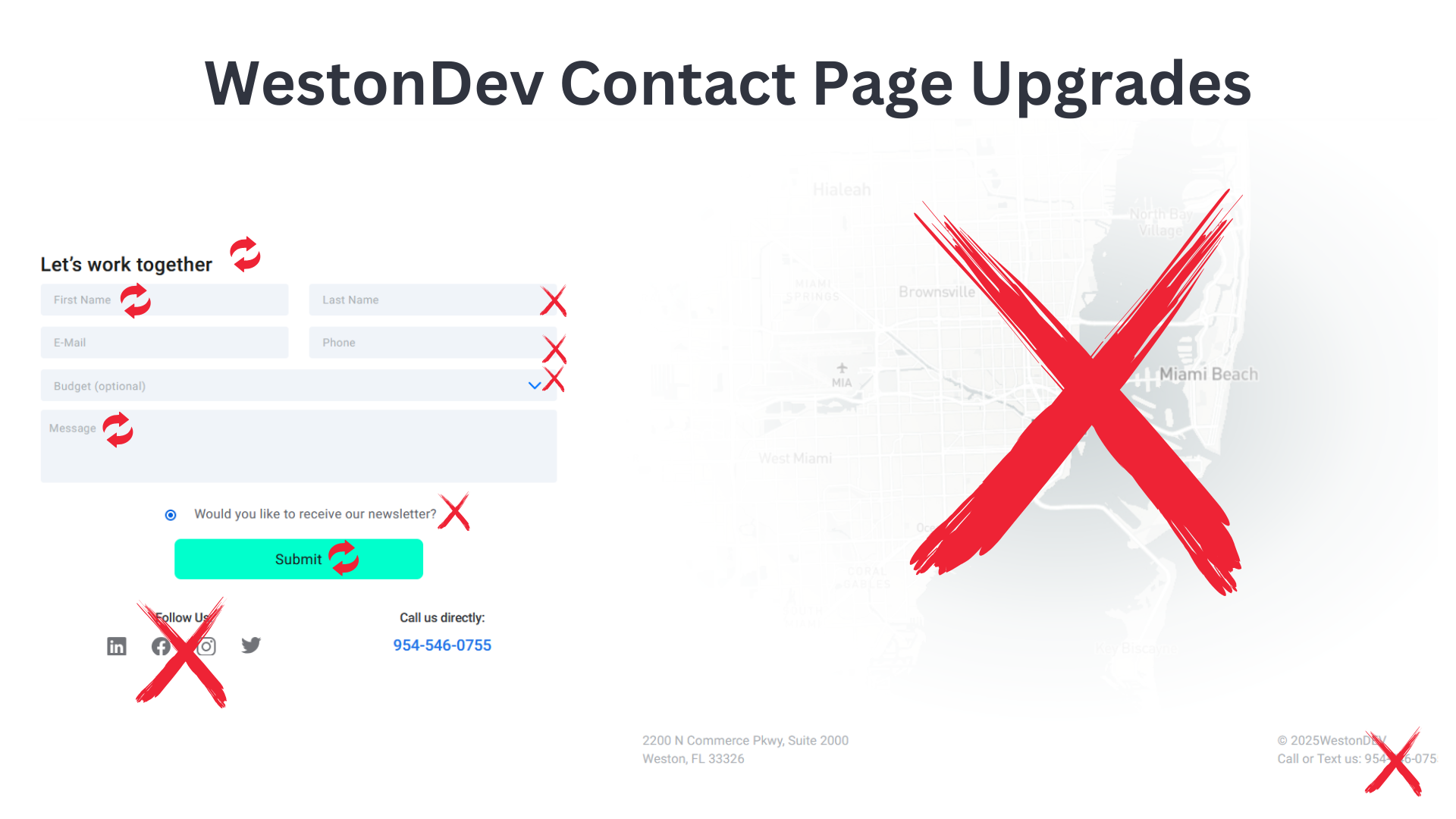
The attached image highlights the exact changes I’m recommending.
Here’s what I’d change:
1. Center the form
A contact form should be the focal point, not an afterthought. When the form is aligned to the side, it competes for attention with other elements. Centering it improves balance, reduces visual clutter, and makes it easier to scan.
🔹 Example: Apple’s customer support pages often center key forms and CTAs, keeping attention where it matters.
2. Change the heading to “How Can We Help?”
“Let’s Work Together” sounds transactional. It implies commitment. But many visitors aren’t ready to “work together” yet.
A softer, more inviting phrase like “How Can We Help?” removes pressure. It signals that reaching out is easy and casual.
🔹 Example: Zendesk’s Contact page keeps things warm and approachable with headings like “Let’s Talk” and “We’d Love to Hear From You.”
3. First Name → Name
Why split name fields into first and last? For most businesses, a single “Name” field is enough. It makes the form feel less like an official document and more like a simple request.
4. Remove the Last Name field
If you collect emails, you can deduce last names from there. And if last names really matter, you can ask for them later in the conversation.
Fewer fields = more completions.
🔹 Example: Expedia saw a 12% increase in form completions simply by removing a redundant field in their checkout process.
5. Remove the Phone field
Most visitors don’t want to give out their phone number unless they absolutely have to. Asking for it too soon creates friction.
Better to leave it out and request it later if needed.
6. Remove the Budget field
Visitors often hesitate to fill out budget fields because they fear saying the “wrong” number. This hesitation can lead to form abandonment.
The budget conversation is better suited for a discovery call.
🔹 Example: Many high-end agencies, like Webflow Enterprise, don’t include budget fields—knowing that the real sales process happens in conversation, not in a form.
7. Revise the Message field placeholder text
Nobody likes staring at a blank text box.
Instead of a generic “Message” label, try “Tell us more” or “What are you looking for?”. A slight nudge makes it easier for visitors to start typing.
🔹 Example: Airbnb’s help center uses friendly, question-based prompts to encourage users to describe their issue.
8. Remove the newsletter signup
Someone filling out a contact form isn’t looking to subscribe—they’re looking to connect.
Adding a newsletter checkbox here creates confusion. It’s an unnecessary distraction that won’t help conversion rates.
9. Change the button text to something action-driven
“Submit” is robotic. “Send” is uninspiring.
Instead, use action-driven text like:
✔ Let’s Talk
✔ Get in Touch
✔ Start the Conversation
A small change, but one that makes clicking feel intentional.
🔹 Example: HubSpot tests different button texts and consistently finds that personalized, action-driven CTAs outperform generic ones.
10. Remove social media icons
You want visitors to fill out the form, not get distracted by Twitter or LinkedIn.
Placing social media icons next to a contact form is like putting a candy bowl next to a checkout counter—some visitors will walk away before they buy.
🔹 Example: A/B tests show that removing social media icons from conversion pages increases form submissions because visitors stay focused.
11. Remove the map
A physical address is useful, but a giant embedded map? Not so much.
Unless walk-in traffic is essential to your business, a map adds clutter without increasing conversions.
12. Remove the bottom phone number
If someone is already filling out a form, they don’t need a phone number distracting them at the last second.
It’s another potential exit point—best to leave it off.
Why These Changes Work
Every unnecessary form field, button, or distraction creates a decision point.
More decisions = more hesitation. More hesitation = fewer leads.
By simplifying the Contact page, WestonDEV (or any agency) can turn more website visitors into real conversations—and more conversations into paying clients.
WestonDev Team, I’d love to hear:
➡ What’s your current conversion rate?
➡ If you implement any of these changes, what impact do you see?
Let’s make this a test, not just a suggestion!


